Examples
Each example is a real run of the skill on a fixture in examples/. Nothing here is mocked up.
Example 1
A landing page that scrolls sideways on phones
YouOur landing page looks off on my iPhone and scrolls sideways. Check it on mobile and fix whatever breaks.
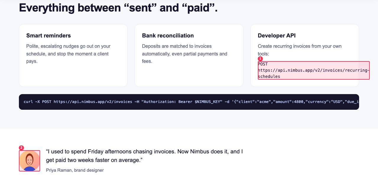
The SaaS landing page has 11 typical AI-built bugs: a 640px hero image, a 760px pricing table, an unbreakable API URL, a CTA on top of the logo, a cookie banner covering 57% of a small phone, tiny social icons and a squashed avatar. The sweep names the element behind each one with a cause hint. After fluid CSS fixes the same sweep comes back clean at all 8 widths, and --compare reports 66 issues fixed.
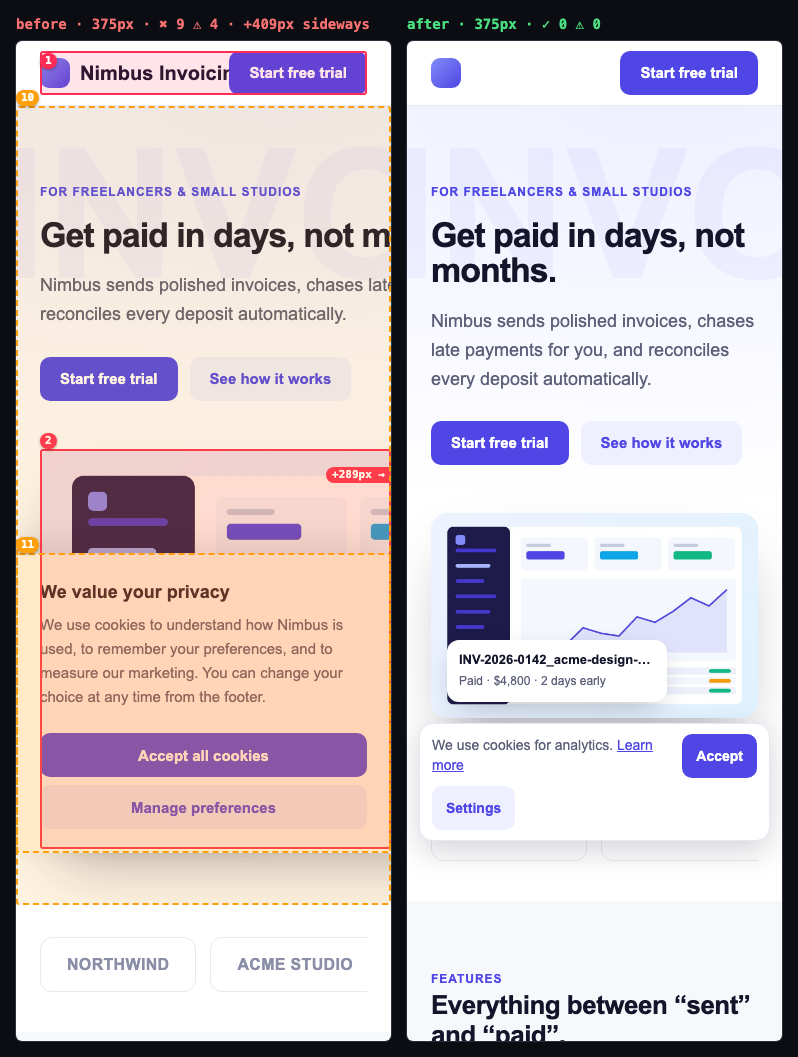
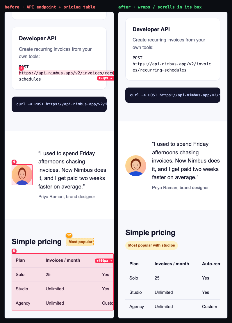
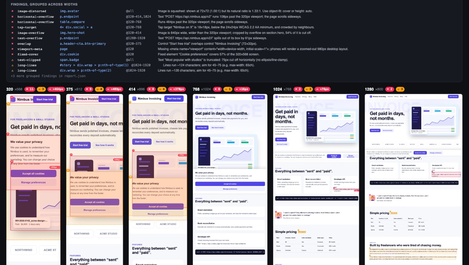
◆ responsive-qa · examples/broken-page.html · 8 widths (320, 375, 414, 768, 1024, 1280, 1440, 1920) · full page
   320×568   ✖ 11  ⚠ 3  scrolls sideways +464px
✖ 42 errors  ⚠ 24 warnings  18 info · 8 viewports · 13.1s
  ✖ horizontal-overflow p.endpoint                               @320–414,1024    Text “POST https://api.nimbus.app/v2” runs 108px past the 320px viewport; the page scrolls sideways.
      ↳ long unbroken word “https://api.nimbus.app/v2/invoic…”: add overflow-wrap: anywhere · same 379px width at every failing viewport → hard-coded width or unbreakable content
  ✖ horizontal-overflow table.compare                            @320–768         Runs 464px past the 320px viewport; the page scrolls sideways.
      ↳ table wider than the screen: wrap it in an overflow-x: auto container · same 760px width at every failing viewport → hard-coded width or unbreakable content
  ✖ image-overflow      img.hero-shot                            @320–414         Image is 640px wide, wider than the 320px viewport; cropped by overflow on section.hero, 54% of it is cut off.
      ↳ no max-width: 100% · CSS width: 640px · same 640px width at every failing viewport → hard-coded width or unbreakable content
  ✖ overlap             a.header-cta.btn-primary                 @320–375         Control “Start free trial” overlaps control “Nimbus Invoicing” (72×32px).
  ✖ fixed-cover         div.cookie                               @320             Fixed element “Cookie preferences” covers 57% of the 320×568 screen.
◆ vs previous run: ✓ 66 fixed · 0 new · 0 remaining
Example 2
An orders dashboard blown open by 1fr
YouThe orders dashboard scrolls sideways on my laptop and it's worse on mobile. Find out why and fix it properly, no overflow-x: hidden.
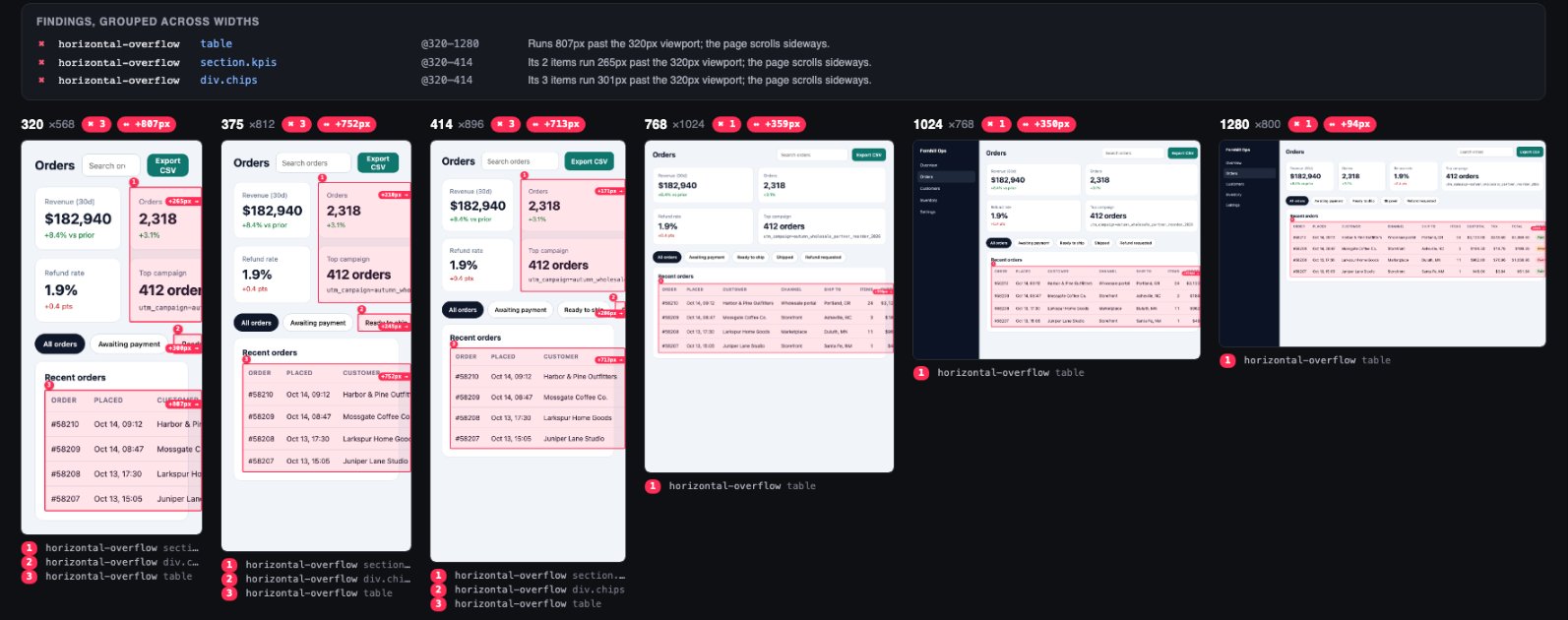
An app shell built as grid-template-columns: 232px 1fr lets a 10-column table stretch the main column, so the page scrolls sideways even at 1280px. Run 1 names main as the culprit, suggests minmax(0, 1fr), and lets main shrink for a moment to list what inside it would still overflow: the table, a filter row that doesn't wrap, and a KPI grid stretched by a long campaign tag. Run 2 (shell fixed) confirms those three, and run 3, with all four fixes, is clean at every width.
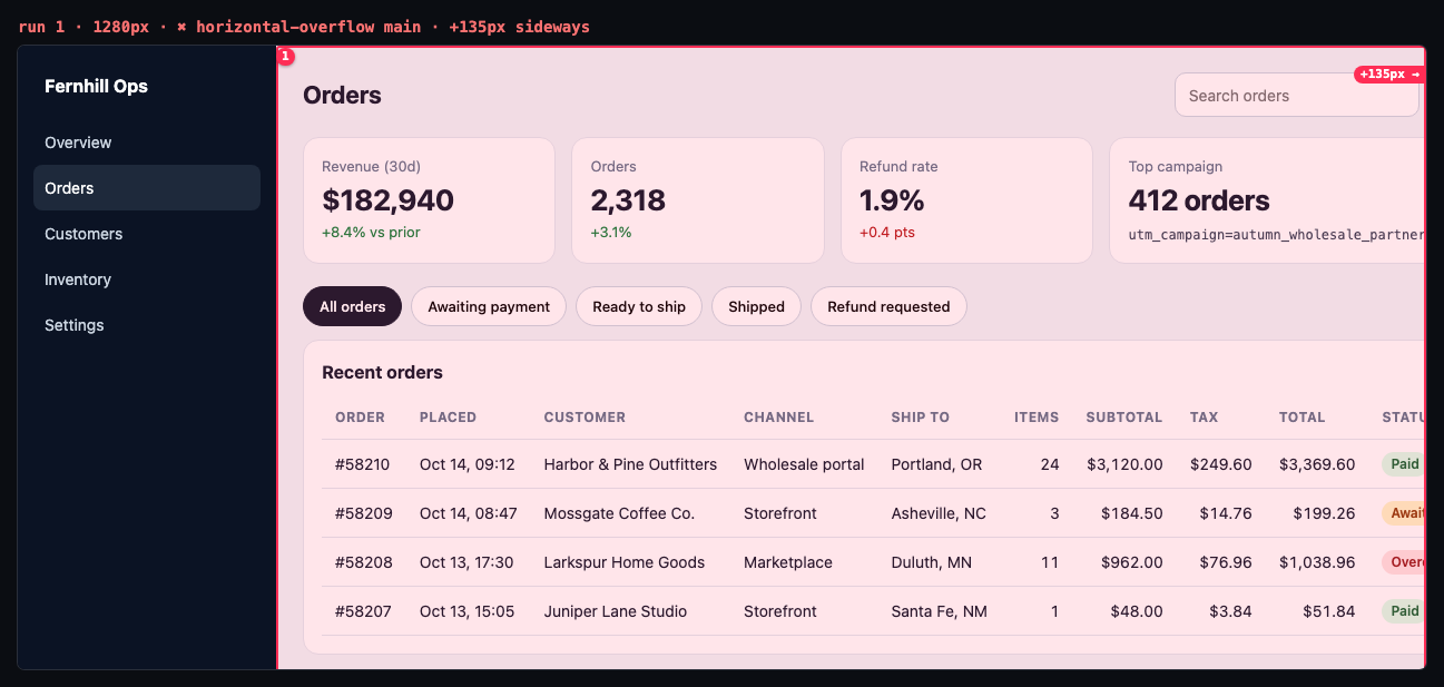
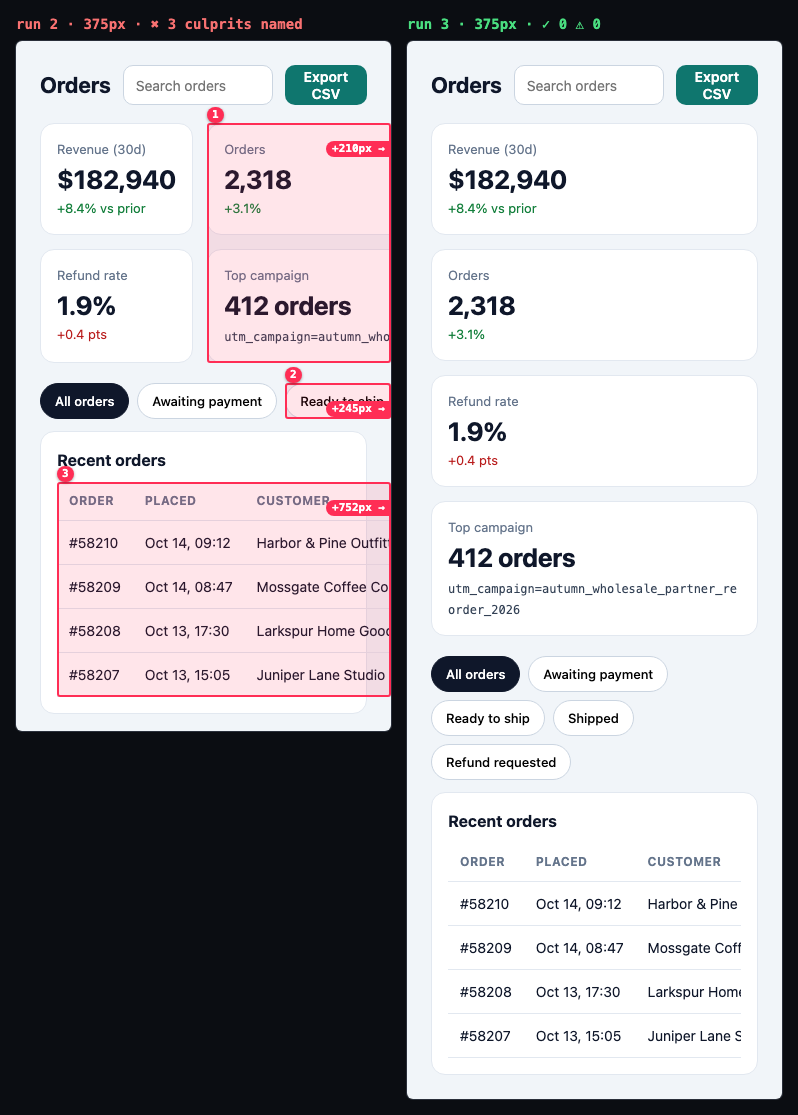
◆ responsive-qa · examples/dashboard/broken.html · 8 widths (320, 375, 414, 768, 1024, 1280, 1440, 1920) · full page
  ✖ horizontal-overflow main                                     @320–1280        Runs 848px past the 320px viewport; the page scrolls sideways.
      ↳ grid item wider than its track; use minmax(0, 1fr) / min-width: 0 · what makes it wide (still overflows once it can shrink): table +807px, div.chips +301px, section.kpis +265px · same 1168px width at every failing viewport → hard-coded width or unbreakable content
        · table +807px: table wider than the screen: wrap it in an overflow-x: auto container
        · div.chips +301px: 3 flex items overflow the row: add flex-wrap: wrap, or min-width: 0 on the items
        · section.kpis +265px: 2 grid items are wider than their tracks (153.125px 394.062px): 1fr/auto tracks can't shrink below their widest content; use minmax(0, 1fr) and min-width: 0 · widest unbreakable content: “utm_campaign=autumn_wholesale_partner_re…” (add overflow-wrap: anywhere)
◆ responsive-qa · examples/dashboard/shell-fixed.html · 8 widths (320, 375, 414, 768, 1024, 1280, 1440, 1920) · full page
  ✖ horizontal-overflow table                                    @320–1280        Runs 807px past the 320px viewport; the page scrolls sideways.
      ↳ table wider than the screen: wrap it in an overflow-x: auto container · same 1086px width at every failing viewport → hard-coded width or unbreakable content
  ✖ horizontal-overflow section.kpis                             @320–414         Its 2 items run 265px past the 320px viewport; the page scrolls sideways.
      ↳ 2 grid items are wider than their tracks (153.125px 394.062px): 1fr/auto tracks can't shrink below their widest content; use minmax(0, 1fr) and min-width: 0 · widest unbreakable content: “utm_campaign=autumn_wholesale_partner_re…” (add overflow-wrap: anywhere) · same 394px width at every failing viewport → hard-coded width or unbreakable content
  ✖ horizontal-overflow div.chips                                @320–414         Its 3 items run 301px past the 320px viewport; the page scrolls sideways.
      ↳ 3 flex items overflow the row: add flex-wrap: wrap, or min-width: 0 on the items
◆ vs previous run: ✓ 6 fixed · ✖ 12 new · 0 remaining
◆ vs previous run: ✓ 12 fixed · 0 new · 0 remaining
Example 3
A blog post with a runaway code block and hidden anchors
YouRun a responsive QA pass on the edge-caching blog post before I publish it.
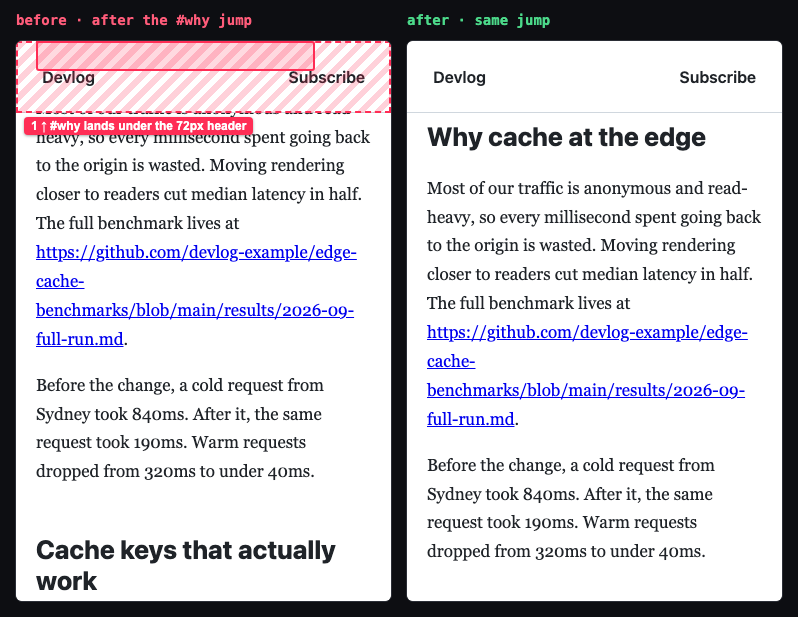
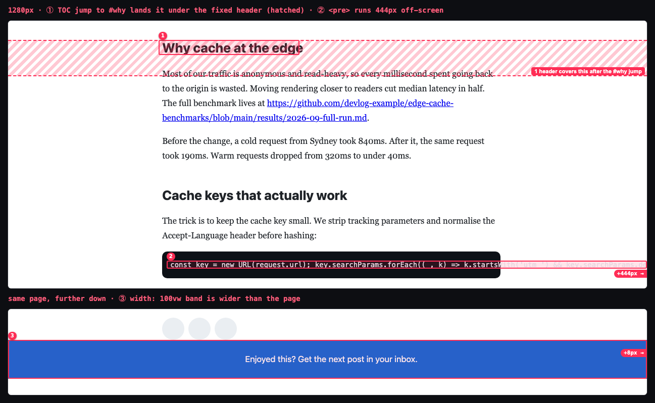
A long article with a fixed 72px header. A one-line <pre> widens the page at every width, the diagram has a CSS width of 720px, every table-of-contents link lands its heading under the header, and a width: 100vw band ends up wider than the page wherever a classic (Windows) scrollbar takes up room. Four small CSS fixes, including html { scroll-padding-top: 80px }, clear all 24 errors.
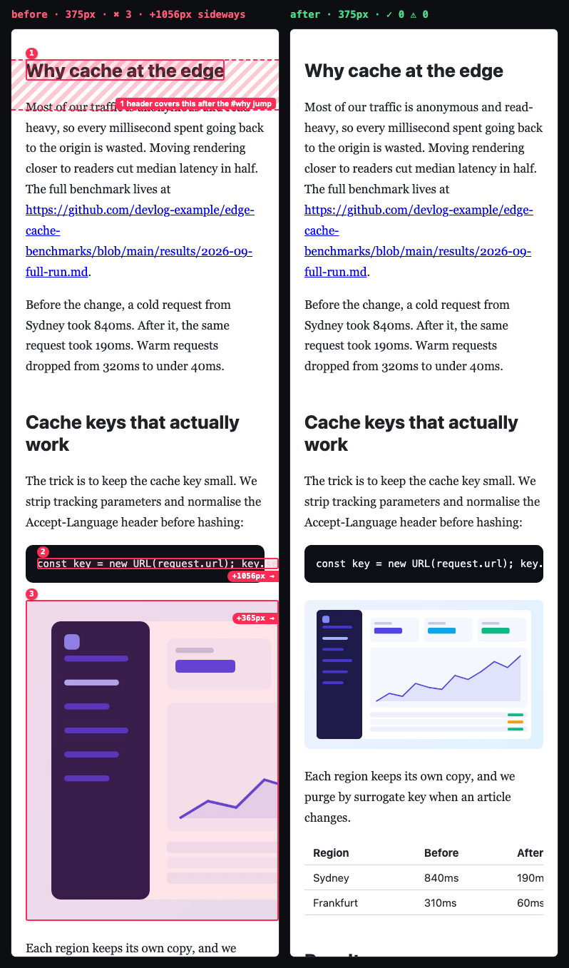
◆ responsive-qa · examples/fixtures/blog.html · 8 widths (320, 375, 414, 768, 1024, 1280, 1440, 1920) · full page
✖ 24 errors  ⚠ 0 warnings  0 info · 8 viewports · 13.4s
  ✖ anchor-hidden       #why                                     @all             4 of 4 in-page links (#why, #caching, #results, #subscribe) jump to a heading that lands completely under the fixed header “DevlogSubscribe” (72px tall).
      ↳ add html { scroll-padding-top: 80px } (or scroll-margin-top: 80px on the targets)
  ✖ horizontal-overflow pre.snippet                              @all             Text “const key = new URL(request.ur” runs 1111px past the 320px viewport; the page scrolls sideways.
      ↳ code/pre block keeps lines unwrapped: give the <pre> overflow-x: auto (and max-width: 100%) · same 1395px width at every failing viewport → hard-coded width or unbreakable content
  ✖ image-overflow      img.diagram                              @320–768         Image is 720px wide and runs 420px past the 320px viewport; the page scrolls sideways.
      ↳ <img> has no max-width: 100% · CSS width: 720px · same 720px width at every failing viewport → hard-coded width or unbreakable content
  ✖ horizontal-overflow div.band                                 @1024–1920       Runs 8px past the 1009px-wide page (1024px window minus its scrollbar); the page scrolls sideways.
      ↳ width: 100vw includes the 15px classic scrollbar (Windows/Linux): use width: 100%, or move the full-bleed band out of the centred container · negative margin (-177.234px / 0px)
✓ No errors  no warnings  8 viewports · 12.6s
◆ vs previous run: ✓ 24 fixed · 0 new · 0 remaining
About this skill
The most common complaint about AI-built UIs: it looks fine at the one width the agent imagined, then the page scrolls sideways on an iPhone, the header CTA sits on top of the logo, a long URL bursts out of a card, and the cookie banner covers half the screen.
responsive-qa opens the page in a real Chromium at 8 widths (320 → 1920). It measures the live DOM for those bugs and outlines each one on a screenshot. Then it hands the agent a contact sheet, a JSON report and the exact element to blame, and the agent fixes the root cause and re-runs until the report is clean.
What it catches
| Check | Example |
|---|---|
| Horizontal scroll | A 760px table makes the whole page scroll sideways. The tool names table.compare and hints "hard-coded width". Also: 1fr grid tracks blown open by a long email, flex children stuck at min-width: auto, <pre> blocks without a scroll box, ribbons with right: -16px, and width: 100vw bands (desktop widths emulate a 15px Windows scrollbar, so they show up) |
| Images too wide / distorted | A width="640" hero image cropped on phones; a 4:3 avatar squashed into a circle |
| Text spilling or clipped | Unbreakable URL leaving its card; badge text cut off with no ellipsis; white hero text wrapping below a fixed-height photo onto the white page (contrast-checked) |
| Overlaps | An absolutely positioned CTA covering the logo (checked against real paint order, so layered designs don't false-alarm) |
| Tap targets | Under 24×24px with WCAG 2.5.8's 24px spacing circle hitting a neighbour (error); under 44×44px (AAA / Apple HIG) is listed as info |
| Readability | Text under 12px on phones; paragraphs over ~90 characters per line on desktop |
| Screen hogs | Fixed/sticky banners covering > 30% of a phone screen; a fixed 460px modal cut off on a 375px phone |
| Anchor jumps | #pricing links landing the heading under a sticky header (no scroll-padding-top) |
| Viewport meta | Missing width=device-width, or zoom disabled |
It stays quiet about things that are fine: horizontally scrolling carousels and code blocks, text-overflow: ellipsis, line-clamp, .sr-only and off-page skip links, collapsed accordions, decorative aria-hidden / alt="" art bleeding off the edge, images cropped inside cards, off-canvas drawers, floating labels inside their inputs, rotated ribbons, stacked sticky cards, scaled-down product mocks, content scrolling under a sticky header, links inside sentences, and text hidden under opaque layers.
Precision is measured, not assumed. On stripe.com, github.com, tailwindcss.com, gov.uk, linear.app and vercel.com it reports 0 errors; each earlier false positive was checked on the screenshot and fixed. It still finds every planted bug in the bundled fixtures, and the real bugs in the W3C "BAD" demo page.
Example prompts
- "Check my landing page on mobile."
- "Why does my page scroll sideways on iPhone?"
- "The pricing page breaks on tablets, can you fix it?"
- "I just restyled the header, make sure it works at every breakpoint."
- "Run a responsive QA pass on /, /pricing and /blog before I ship."
Requirements
- Node.js 18+
- Playwright 1.63.0 + Chromium. Run
bash scripts/setup.shonce; it falls back to installed Chrome or Edge. - A page to test: a local dev server URL (the skill can find a running one), any reachable URL, or a local
.htmlfile.
Manual use
bash scripts/setup.sh
node scripts/detect-server.mjs                                   # which local servers are up?
node scripts/sweep.mjs http://localhost:3000 --full-page
node scripts/sweep.mjs http://localhost:3000 --pages /,/pricing --widths 360,390,768,1280
node scripts/sweep.mjs ./index.html --full-page --compare         # after a fix: what changed?
node scripts/sweep.mjs --help
Output (in ./.knack/responsive-qa/):
contact-sheet.png: grouped findings on top, then every viewport side by side with issues outlined and numberedshots/<page>/<w>x<h>.png: full-size annotated screenshot per viewportshots/<page>/<w>x<h>-jump-<id>.png: foranchor-hidden, the screen right after the jump, with the header and the hidden heading outlinedreport.json: machine-readable issues with selector, bounding box, element classes/text and cause hints, plus info items (44px targets, CLS) and notes (screenshot cap, infinite scroll)report.prev.json: the previous run, used by--compare
Exit codes are CI-friendly: 0 clean, 2 issues at or above --fail-on (default error), 1 tool error.
Sample output
◆ responsive-qa · file:///…/examples/broken-page.html · 8 widths (320, 375, 414, 768, 1024, 1280, 1440, 1920) · full page
   320×568   ✖ 11  ⚠ 3  scrolls sideways +464px
   375×812   ✖ 9  ⚠ 4  scrolls sideways +409px
   …
  1920×1080  ✖ 2  ⚠ 3

✖ 42 errors  ⚠ 24 warnings  18 info · 8 viewports · 13.1s
  ✖ image-distorted     img.avatar          @all        Image is squashed: shown at 72×72 (1.00:1) but its natural ratio is 1.33:1. …
  ✖ tap-target          4× div.social > a   @320–768    Tap target “Nimbus on X” is 18×18px, below the 24×24px WCAG 2.2 AA minimum, and crowded …
  ✖ horizontal-overflow table.compare       @320–768    Runs 464px past the 320px viewport; the page scrolls sideways.
      ↳ table wider than the screen: wrap it in an overflow-x: auto container · same 760px width at every failing viewport → …
  ✖ image-overflow      img.hero-shot       @320–414    Image is 640px wide, wider than the 320px viewport; cropped by overflow on section.hero, 54% of it is cut off.
  ✖ overlap             a.header-cta        @320–375    Control “Start free trial” overlaps control “Nimbus Invoicing” (72×32px).
  ✖ fixed-cover         div.cookie          @320        Fixed element “Cookie preferences” covers 57% of the 320×568 screen.
  ⚠ text-clipped        span.badge          @all        Text “Most popular with studios” is truncated: 75px cut off horizontally …
  …
◆ Contact sheet → .knack/responsive-qa/contact-sheet.png
After the fixes (examples/fixed-page.html): ✓ No errors no warnings.
Try it
examples/broken-page.html is a small landing page with one planted bug per detector, each marked BUG n in the source. examples/fixed-page.html is the same page fixed with fluid CSS (FIX n). examples/fixtures/ adds three AI-style pages with planted bugs (a dashboard, a blog post, a landing page) and clean-tricky.html, a page of deliberate patterns that must produce zero findings:
node scripts/sweep.mjs examples/broken-page.html --full-page   # 11 bugs found
node scripts/sweep.mjs examples/fixed-page.html --full-page    # 0 errors, 0 warnings
node scripts/selftest.mjs                                      # every fixture: planted bugs found, clean pages clean
Examples
Three worked examples in examples/, each one real sweep.mjs runs on a bundled page with cropped evidence in examples/output/ (manifest: examples/examples.json):
- Landing page (
broken-page.html→fixed-page.html): 11 classic phone bugs found with their culprits. 42 errors / 24 warnings → 0 / 0, with--comparereporting 66 fixed. - Orders dashboard (
dashboard/broken.html→shell-fixed.html→fixed.html): a232px 1frapp shell stretched by a wide table. The first run blamesmain, suggestsminmax(0, 1fr)and already lists the three culprits inside it (table, filter chips, KPI grid) by lettingmainshrink for a moment. The second run confirms them, and the third run is clean. - Blog post (
fixtures/blog.html→blog/fixed.html): a runaway<pre>, a 720px diagram, TOC anchors landing under a fixed header, and a100vwband that only breaks with a classic scrollbar. 24 errors → 0.
Limits
Chromium only, emulated widths at 1× scale. It doesn't cover Safari-specific rendering, browser chrome or safe areas. It tests the page as loaded (no hover, open menus or modals) and needs a URL that works without login. The checks are tuned heuristics; --ignore, --skip and data-responsive-qa="ignore" handle the rest. See references/fix-patterns.md for fixes and false-positive guidance.
License
MIT