Examples
Each example is a real run of the skill on a fixture in examples/. Nothing here is mocked up.
Example 1
A CTA restyle that quietly breaks the pricing buttons
YouAdd before/after screenshots to my PR and check for visual regressions.
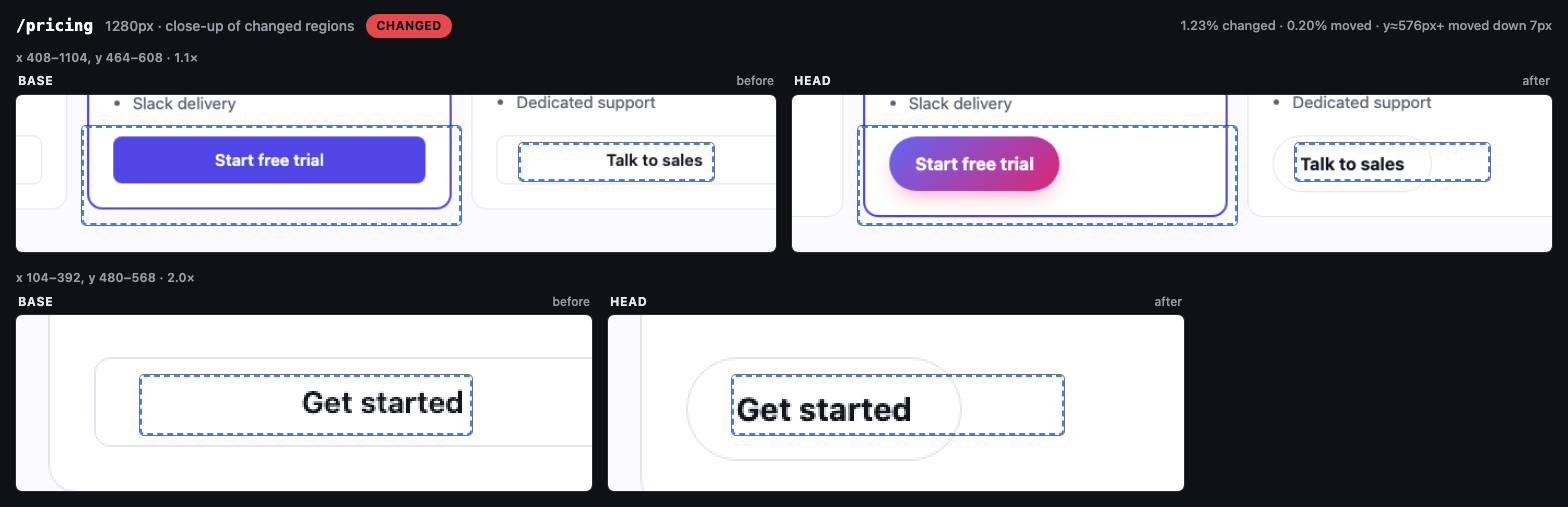
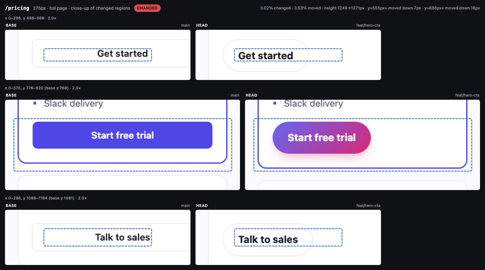
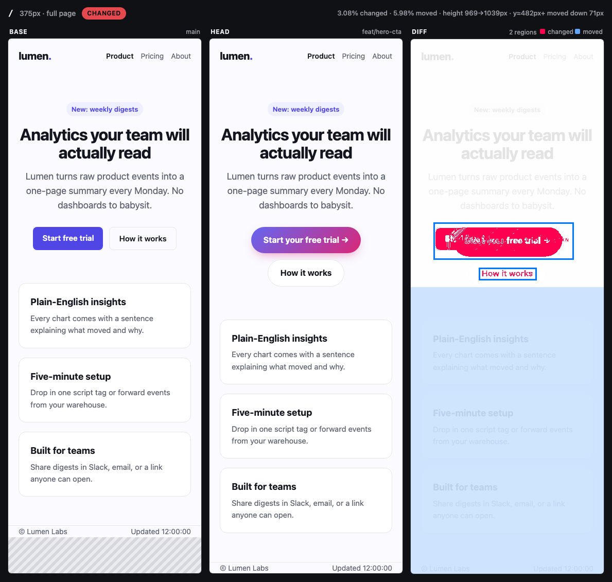
The PR restyles the hero CTA as a gradient pill, but the same stylesheet edit drops the rule that made pricing-card buttons full width. The hero change is the intended one. The /pricing close-up shows every plan button shrinking to fit its label, which the PR never meant to do. On mobile the longer CTA also pushes "How it works" onto its own line, moving the rest of the page down 71px. /about stays at 0 pixels.
Captured 3 pages at 375 / 1280px (full page): **4 changed**, 0 minor, 2 unchanged. Base: main · Head: feat/hero-cta.

| Page | Width | Result | Pixels changed | Notes |
|---|---:|---|---:|---|
| `/` | 375px | **changed** | 3.08% (5.98% moved) | height 969 → 1039px; 2 changed regions; content from y≈482px moved down 71px |
| `/` | 1280px | **changed** | 0.99% (0.85% moved) | 1 changed region; content from y≈406px moved down 7px |
| `/pricing` | 375px | **changed** | 3.02% (3.53% moved) | height 1249 → 1271px; 3 changed regions; content from y≈555px moved down 7px; content from y≈886px moved down 16px |
| `/pricing` | 1280px | **changed** | 1.23% (0.20% moved) | 3 changed regions; content from y≈576px moved down 7px |
| `/about` | 375px | unchanged | 0% |  |
| `/about` | 1280px | unchanged | 0% |  |
Example 2
A design-token tweak too faint to see by eye
YouDid my theme token change affect anything I didn't expect?
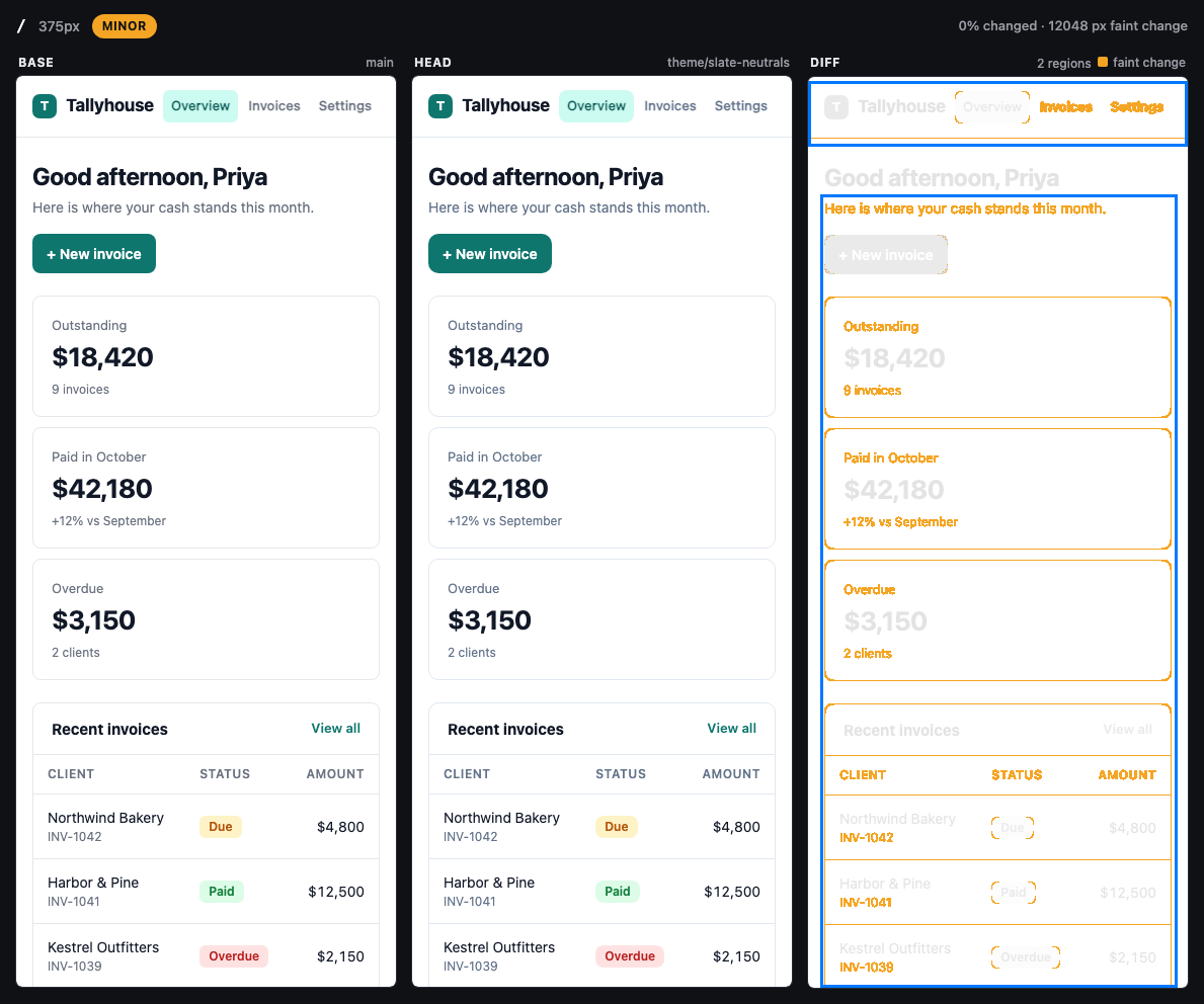
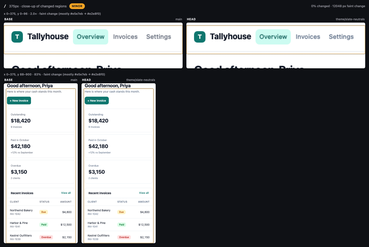
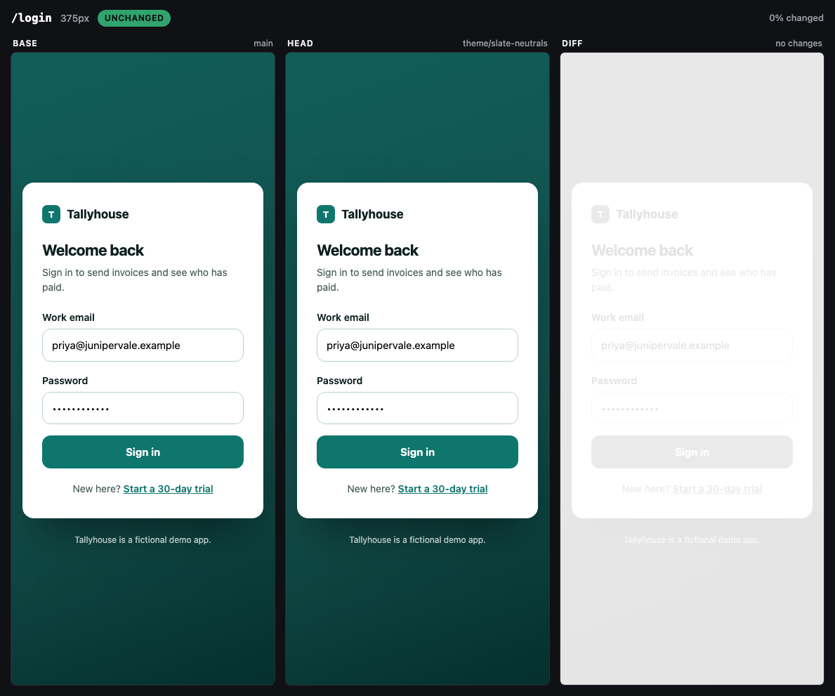
One edit to tokens.css moves the neutrals from gray to slate (#6b7280 to #64748b for muted text, #e5e7eb to #e2e8f0 for borders) and rounds corners by 2px. affected-pages.mjs traced tokens.css to all four pages through their <link> tags and flagged it as a global change. The capture puts every app page in "minor" with the exact colour pair named and the faint pixels traced in amber. The sign-in page, which only uses the brand tokens, stays at 0 pixels, so the change is contained.
Captured 4 pages at 375 / 1280px: **0 changed**, 6 minor, 2 unchanged. Base: main · Head: theme/slate-neutrals.

| Page | Width | Result | Pixels changed | Notes |
|---|---:|---|---:|---|
| `/` | 375px | minor | 0% | faint change in 12048 px (below the visible threshold: a colour tweak or a pale element's edge; amber in diff); most common: #e5e7eb → #e2e8f0 |
| `/` | 1280px | minor | 0% | faint change in 19190 px (below the visible threshold: a colour tweak or a pale element's edge; amber in diff); most common: #e5e7eb → #e2e8f0 |
| `/invoices` | 375px | minor | <0.01% | 2 changed regions; faint change in 12066 px (below the visible threshold: a colour tweak or a pale element's edge; amber in diff); most common: #e5e7eb → #e2e8f0 |
| `/invoices` | 1280px | minor | <0.01% | 2 changed regions; faint change in 19777 px (below the visible threshold: a colour tweak or a pale element's edge; amber in diff); most common: #e5e7eb → #e2e8f0 |
| `/settings` | 375px | minor | 0% | faint change in 10656 px (below the visible threshold: a colour tweak or a pale element's edge; amber in diff); most common: #e5e7eb → #e2e8f0 |
| `/settings` | 1280px | minor | 0% | faint change in 12590 px (below the visible threshold: a colour tweak or a pale element's edge; amber in diff); most common: #e5e7eb → #e2e8f0 |
| `/login` | 375px | unchanged | 0% |  |
| `/login` | 1280px | unchanged | 0% |  |
Example 3
A banner added, a card removed, and the page below just moved
YouVisual diff this branch. I swapped the onboarding checklist for a trial banner.
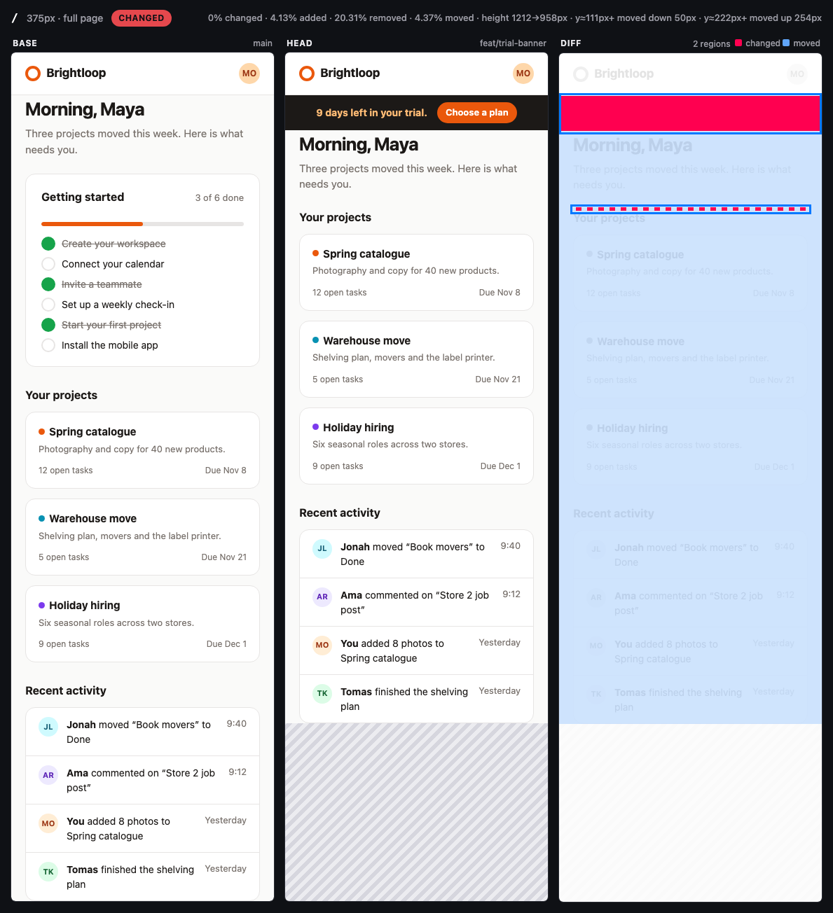
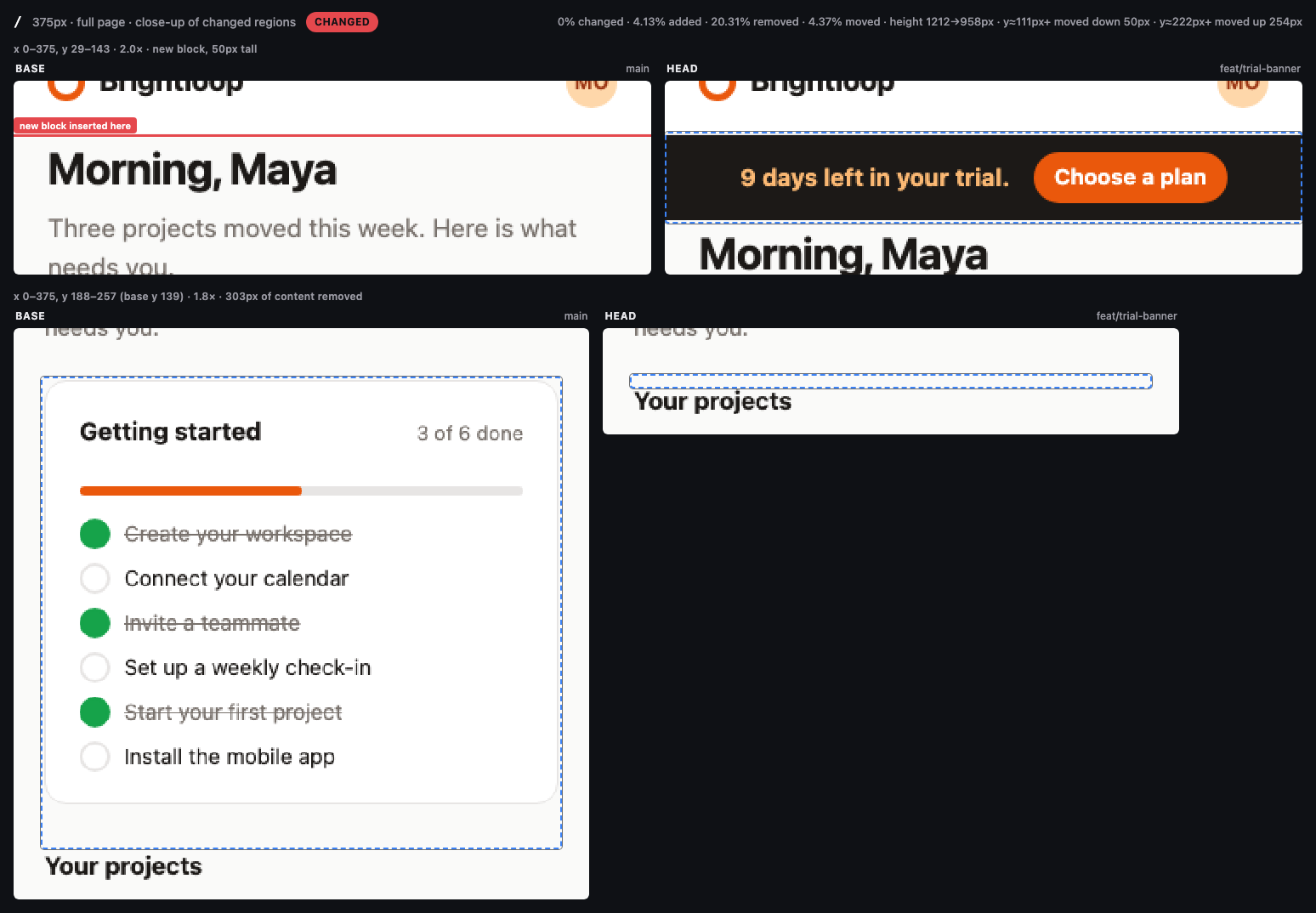
The PR adds a trial banner under the header on every page and removes the "Getting started" checklist from home. A plain pixel diff would paint everything below the banner red. Row alignment instead reports a 50px block added, 303px of content removed, and the rest of the page as moved: down 50px, then up 254px. The headline change stays at 0%, with added, removed and moved pixels counted separately. Reviewers can see that the projects and activity feed below are untouched. On /projects the only change is the banner. Everything under it is a blue band.
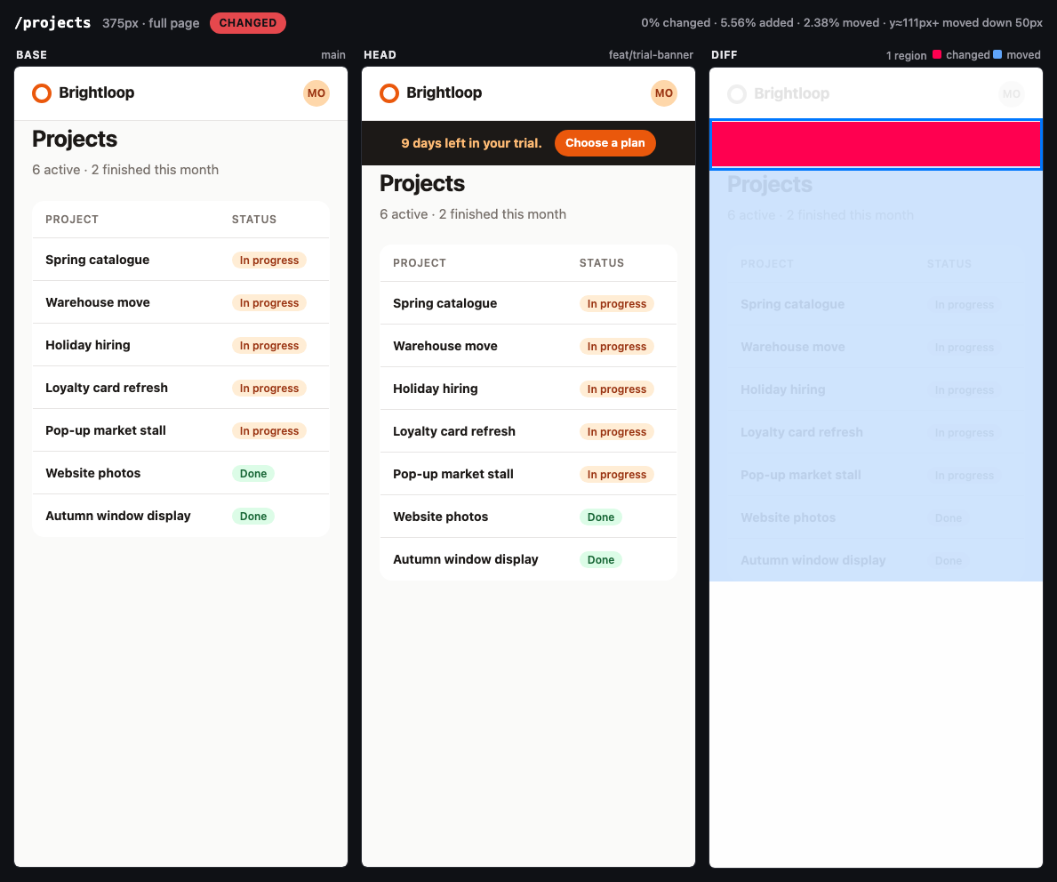
Captured 2 pages at 375 / 1280px (full page): **4 changed**, 0 minor, 0 unchanged. Base: main · Head: feat/trial-banner.

| Page | Width | Result | Pixels changed | Notes |
|---|---:|---|---:|---|
| `/` | 375px | **changed** | 0% (4.13% added, 20.31% removed, 4.37% moved) | height 1212 → 958px; 50px-tall block added at y≈61px; 303px of content removed at y≈220px; content from y≈111px moved down 50px; content from y≈222px moved up 254px |
| `/` | 1280px | **changed** | 0% (5.56% added, 16.39% removed, 1.91% moved) | 50px-tall block added at y≈61px; 218px of content removed at y≈199px; content from y≈111px moved down 50px; content from y≈201px moved up 168px |
| `/projects` | 375px | **changed** | 0% (5.56% added, 2.38% moved) | 50px-tall block added at y≈61px; content from y≈111px moved down 50px |
| `/projects` | 1280px | **changed** | 0% (5.56% added, 0.97% moved) | 50px-tall block added at y≈61px; content from y≈111px moved down 50px |
About this skill
Code review is blind to how a frontend change looks. A one-line CSS edit can restyle the button you meant to change and quietly break three pages you didn't. This skill lets your agent show reviewers the difference: it screenshots the affected pages on the base branch and on your branch, pixel-diffs them at mobile and desktop widths, looks at the results, and writes a "Visual changes" section for the PR that separates what you meant to change from what might be a regression.
What it does
- Finds the pages to check. Maps changed files to routes for Next.js (app and pages router), Remix / React Router, SvelteKit, Nuxt, Astro, plain HTML and React Router SPAs, following imports from changed components and stylesheets up to the pages that use them.
- Brings up the "before" build in a temporary git worktree on its own port, with dependencies installed by your lockfile's package manager. Your working tree is never touched.
- Captures and diffs each page × width with Playwright and pixelmatch, after
stabilizing: a virtual clock that freezes JS timers and animation frames identically on
both sides, seeded randomness, frozen video/GIFs/animations, and waits for fonts,
images and
aria-busy. Unchanged pages diff at exactly 0 pixels on 116 of 120 tested pairs (tailwindcss.com, swiperjs.com, playwright.dev, animate.style, an Astro blog and a Next.js app), up from 13 of 32 live-site pairs differing before. - Separates cause from cascade. Rows that only moved are recognised by row alignment
and shown as a blue band, so a taller hero is one red box plus "content below y≈482
moved down 71px", not a wall of red. Removed and added blocks are named, faint colour
tweaks below the visible threshold are flagged in amber, and
focus.pngshows each changed region side by side at up to 2x. Also reports size changes, new console errors and pages that start returning 404. - Reviews the evidence. The agent reads every close-up and compare image, describes the changes in plain words, and flags anything that looks unintended.
- Writes the PR section with a table, close-ups and side-by-side images. Uploading
images (gh
--attach, an assets branch) or editing the PR only happens if you say yes.
Try it
add before/after screenshots to my PR
did my CSS refactor change anything visually?
visual diff this branch against main at 375, 768 and 1280
check /settings and /billing for visual regressions before I merge
Requirements
- Node.js 18+ and git
- Chromium via Playwright (installed by
scripts/setup.sh, ~150 MB once), or a local Chrome/Edge as fallback - Your app's own toolchain (pnpm / yarn / npm / bun) to run the base build
- Optional:
ghCLI if you want the agent to update the PR for you
bash scripts/setup.sh
Examples
examples/ holds three worked examples, each a real capture.mjs run on a
fictional fixture, with the images and summary.md excerpts listed in
examples/examples.json (selected images in examples/output/):
hero-cta-regression(before/→after/): an intended CTA restyle, plus a regression it causes on/pricingthatfocus.pngmakes obvious.theme-token-refresh(theme-tokens/): a gray → slate token change too faint to see by eye, reported asminorwith the colour pair named (#e5e7eb → #e2e8f0). The sign-in page correctly stays at 0 pixels.banner-replaces-checklist(layout-shift/): a banner added and a card removed. The diff reports "50px-tall block added" and "303px of content removed" and shows the rest of the page as a blue moved band, not a regression.
Run the example
examples/ holds two versions of a tiny static site. The "after" version is a PR called
Restyle hero CTA: the hero button becomes a gradient pill (intended), but the same
stylesheet change drops the rule that made pricing-card buttons full width (unintended),
and the longer CTA pushes the secondary button onto a new line on mobile.
node scripts/capture.mjs --base examples/before --head examples/after \
  --pages /,/pricing,/about --full-page \
  --label-base main --label-head feat/hero-cta
Output in ./.knack/pr-visual-diff/:
summary.md   summary.json
pages/home/375/{base,head,diff,compare,focus}.png
pages/home/1280/...   pages/pricing/375/...   pages/pricing/1280/...   pages/about/...
summary.md starts like this:
| Page | Width | Result | Pixels changed | Notes |
|---|---|---|---|---|
/ |
375px | changed | 3.08% (5.98% moved) | height 969 → 1039px; 2 changed regions; content from y≈482px moved down 71px |
/ |
1280px | changed | 0.99% (0.85% moved) | 1 changed region; content from y≈406px moved down 7px |
/pricing |
375px | changed | 3.02% (3.53% moved) | height 1249 → 1271px; 3 changed regions; content from y≈555px moved down 7px; content from y≈886px moved down 16px |
/pricing |
1280px | changed | 1.23% (0.20% moved) | 3 changed regions; content from y≈576px moved down 7px |
/about |
375px | unchanged | 0% | |
/about |
1280px | unchanged | 0% |
…followed by, per changed pair, focus.png (the changed regions, base vs head, zoomed)
and compare.png (base | head | diff). The pricing close-up shows the regression at a
glance: the plan buttons lost their full width. Numbers vary slightly by OS font rendering.
Scripts
| Script | Purpose |
|---|---|
affected-pages.mjs |
Changed files → candidate routes with confidence and reasons |
worktree-serve.mjs |
start base in a temp worktree, serve head, list, stop --all |
capture.mjs |
Screenshots, diffs, compare images, summary.md / summary.json |
publish-assets.mjs |
Optional: print the gh --attach upload command, or host images on an orphan branch (dry run unless --push) |
All support --help.
Limitations
- Base and head must render the same data. If they talk to different databases, diffs show data, not UI. Mask data regions or point both at the same backend.
- Logged-in pages need a Playwright storage-state file that you create by logging in
yourself (
npx playwright codegen --save-storage=auth.json <url>). - Route detection is heuristic. Config-based routers and workspace packages need you (or the agent) to pick pages by hand; dynamic routes need real parameter values.
- Getting images into the PR: drag and drop (works everywhere),
gh pr comment --attach(gh 2.99+, push access, github.com only), an assets branch, or your existing CI artifact hosting. Seereferences/pr-images.md. - Determinism covers timers,
requestAnimationFrame,Date,Math.random, CSS and JS Web Animations, video, GIFs and SMIL. Widgets driven by something else (one demo on tailwindcss.com in our tests), canvas/WebGL and third-party embeds can still differ: mask them. Seereferences/stabilization.mdfor the measured flake rates. - Chromium only. Safari/Firefox rendering differences are out of scope.